PROBLEM
RECLAIMING THE STARS
Existing environmental organizations often feel academic or overly clinical. NoGlow needed a brand image that felt modern, urgent, and accessible to the average homeowner and city official. People often associate "dark sky" initiatives with safety concerns (darker streets) or technical difficulty (installation of new light fixtures). The branding needed to dismantle these myths.
DESIGN
COLOR PALETTE
I moved away from traditional "eco-greens" and instead utilized a deep "Midnight Obsidian" base contrasted with "Star-Fire Yellow" and "Slate White". This high-contrast palette mirrors the beauty of a natural night sky while maintaining high legibility for digital interfaces.
LOGO
The logo underwent many iterations to eventually land on an abstract yet readable representation of the night sky being protected by the downward arching line that symbolizes improved light fixtures aimed towards the ground.


LOGO ANIMATION
BRAND STRATEGY
Most environmental campaigns focus on "shame" or "scare tactics." The NoGlow strategy flips the script to focus on curiosity and beauty.
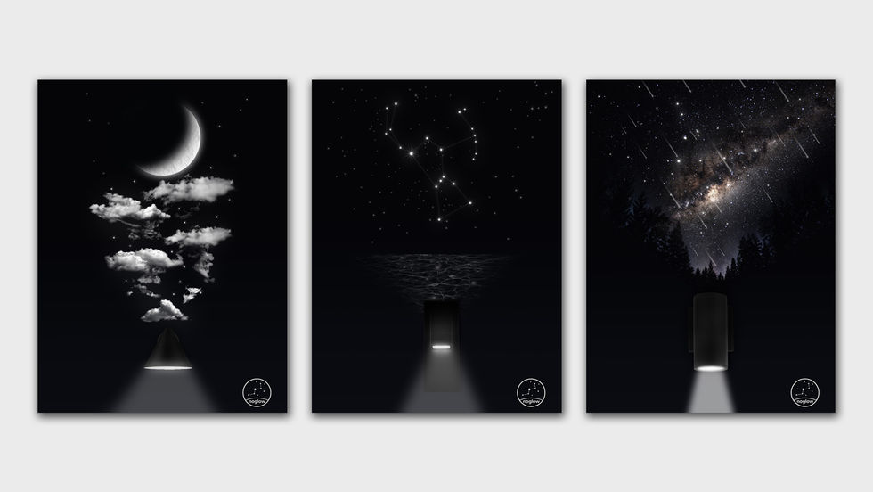
Instead of showing ugly streetlights, I show the Milky Way. The strategy centers on what we are missing rather than what we are doing wrong. By positioning the night sky as a "lost natural wonder," we make light pollution feel like a theft of beauty, which is a more powerful motivator for the general public than technical energy data.

POSTER SERIES

WEBSITE
DIGITAL PRESENCE & ADVERTISING
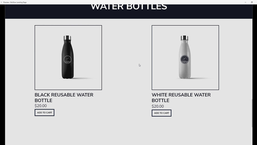
NoGlow's digital presence focuses on carrying over the same "Protect the dark of night" ideas over to its digital interface layouts. Astral photography based landing pages and use of minimalist UI and intuitive UX elements make it easier for the average person to navigate and learn about light pollution.
ADVERTISING
The advertising used for NoGlow's campaign further captures the idea that light is robbing us of something beautiful while simultaneously showcasing different types of light fixtures that will solve the problem. Bold and straight forward typography and stark contrast help solidify the message and drive home the idea.

CONCLUSION
Through a "Darkness-First" design system, I replaced the clinical, often-ignored aesthetic of traditional non-profits with an immersive, high-contrast visual identity. Every touchpoint—from the immersive, interactive website to the strategically reflective billboards—was engineered to prove that switching to "sky friendly" lighting doesn't just reduce pollution; it restores our connection to the stars.
This project was insanely fun to work on as stargazing is one of my most favorite past-times. Taking my telescope outside to look outside is always enjoyable and thinking about what I could see if light pollution were to dissipate really drove my passion when working on NoGlow.


